The Quiet Light Edit: Making UK Winter Greys Look Deliberate, Not Dull
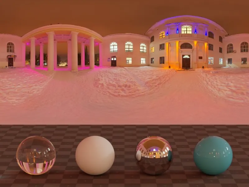
Photo: Sergej Majboroda, CC0, via Wikimedia Commons
Britain in November is a masterclass in soft light. The sun sits low, cloud cover acts like a giant diffuser, and the result is the kind of even illumination that studio photographers pay good money to recreate. The problem is not the grey. The problem is what we do to it in editing suites when we panic and reach for Contrast, Saturation and Dehaze as if they were a triple espresso.
This guide is about editing flat UK winter light with a bit of restraint. The aim is not to make a grey day look like golden hour in the Cotswolds. It is to keep the detail, add shape where it matters, and let muted tones do some of the storytelling. That applies whether you are shooting a portrait in a park, a wet high street, or a batch of candles for a small business website.
White balance first, contrast second
Flat light often looks muddy because the colour temperature is slightly off, not because the scene lacks contrast. A cloudy day in Leeds or Glasgow can push cool blue into skin tones and make white product backgrounds look grey-blue. Start with white balance before you touch anything else.
In Lightroom, use the eyedropper on a neutral grey or white area, then nudge the temperature slightly warmer for portraits. For product shots, accuracy matters more than warmth: check against a white sheet of paper or a grey card. In Affinity Photo, add a White Balance adjustment layer and sample a neutral area; keep the tint close to zero unless indoor lighting has pushed things green. On a phone, Snapseed's White Balance tool and Lightroom Mobile's Temp slider are enough for most edits. The test is simple: skin should look like skin, white should look white, and grey should look like a choice rather than a mistake.
Local contrast beats global contrast
When the sky is a flat ceiling and the pavement is a flat sheet, the temptation is to drag Contrast upwards until the image looks punchy. That usually crushes shadows, clips highlights and gives portraits a slightly aggressive look. A better approach is local contrast: small, controlled adjustments that separate textures without flattening the scene.
In Lightroom, try Texture around +10 and Clarity around +5 to +8. Keep Dehaze low. Use a radial mask or subject mask to add a little Shadows lift on faces, and a linear gradient over the sky with Dehaze at +6 to +10. In Affinity Photo, use Shadows and Highlights gently, then add a subtle S-curve in Curves while lifting the black point slightly. A low-opacity Clarify live filter can add texture, but watch for halos around branches and rooflines. On mobile, Snapseed's Structure and Details tools are easy to overcook; keep Structure under +10 and use Selective adjustments rather than global contrast.
Haze reduction is seasoning, not a cure
Dehaze is useful in UK winter light because it restores midtone separation in grey scenes. It is also the fastest way to make a wet street look radioactive. Use it locally and sparingly. In Lightroom, mask the sky or distant buildings and apply Dehaze at +5 to +12 rather than pushing the whole image. If colours shift too blue or too warm, reduce the amount and correct white balance afterwards.
Affinity Photo does not have a single Dehaze slider, so combine Shadows and Highlights with a Curves adjustment and a touch of Clarity. For free mobile editing, Lightroom Mobile's Dehaze slider is the closest match; Snapseed's Ambiance tool can open up midtones but tends to lift colour, so use it at low strength. The goal is to reveal shape in the grey, not to pretend the weather was different.
When muted tones are the point
Not every winter image needs to look cheerful. Muted tones suit portraits with soft window light, streetscapes with wet pavements and reflections, and small-business product shots where a calm grey background feels more premium than a fake white sweep. The trick is to keep muted colours clean rather than flat.
For portraits, protect skin tones with white balance and local dodge and burn. Do not raise global saturation to compensate for a grey day; instead, add a little warmth to the face and keep the background cool. For streetscapes, leave blacks slightly lifted and let the grey sky sit as atmosphere. For product shots, use Curves to keep the background neutral and the product colour accurate. A consistent grey background can become part of your brand if you repeat it across a range.
Three before-and-after recipes
Lightroom recipe
Before: flat, cool, low separation. After: neutral whites, gentle shape, preserved sky detail.
- White balance: eyedropper on neutral grey, then +150K to +250K for portraits.
- Basic: Exposure +0.10 to +0.20, Highlights -15 to -25, Shadows +20 to +30, Whites +5, Blacks -5 to -10.
- Presence: Texture +10, Clarity +5, Dehaze +4 to +6 globally.
- Masking: sky gradient with Dehaze +8 and Temp -5; subject radial with Shadows +10.
- Colour: reduce global saturation by -3 to -5, then use HSL to keep skin and product colours honest.
Affinity Photo recipe
Before: grey, soft, slightly blue. After: clean neutrals with local texture.
- Add a White Balance adjustment layer and sample a neutral area.
- Use Shadows and Highlights: Shadows +15, Highlights -10.
- Add a Curves adjustment with a gentle S-curve and a lifted black point.
- Apply a Clarify live filter at low opacity, then mask it away from skin and sky.
- Add a subtle Vignette if the frame feels loose, but keep it under 10 percent.
Free mobile recipe
Before: phone JPEG with flat contrast and cool cast. After: brighter midtones and controlled texture.
- Snapseed: Tune Image with Brightness +5, Contrast -5, Shadows +20, Ambiance +8.
- White Balance: +5 warmth, tint neutral.
- Details: Structure +8, Sharpening +5.
- Selective tool: brighten the subject slightly and add warmth to skin.
- Lightroom Mobile alternative: same Basic settings, then mask the sky with Dehaze +8.
A final check before export
Zoom out. Look at the image as a thumbnail, then at 100 percent. Check that whites are not blue, skin is not grey, and the sky has not turned into a fake blue gradient. Flat winter light is not a flaw to erase. It is a quiet kind of light, and the best edits make it look intentional.