The Two-Temperature Room: A Quick White-Balance Check for Lamp-Lit British Homes
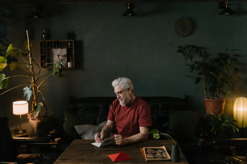
By mid-November, most British homes have a quiet colour argument going on. The window is throwing in cool, blue-ish daylight. The table lamp is doing its best impression of a chip-shop warmer. Neither is wrong, but together they can make a white wall look faintly green and a cream jumper look like a health concern.
This is not a sign that your camera is broken. It is just mixed lighting, and British houses are full of it: sash windows, bay windows, low ceilings, energy-saving bulbs that never quite match the ones in the next room. You can chase a perfectly neutral result, but you will often end up with a room that feels flat and slightly clinical. The better aim is a clear, believable compromise.
Why the room looks wrong, and isn’t
A camera’s auto white balance is a peacekeeper. It looks at the whole scene, guesses what should be white, and picks a number. In a room with warm lamps and a cool window, that guess can swing about depending on where you point the lens. One frame looks cosy; the next looks like a dentist’s waiting room. That inconsistency is the real problem, not the warmth itself.
For client work, inconsistency costs time. If you are photographing a small business interior, a maker’s products in a spare room, or a family portrait by the window, you want a repeatable starting point. A grey card gives you one. It will not remove the mixed light, but it will tell you what the camera thinks neutral looks like in that exact spot.
The five-minute grey-card test
You need a grey card, a camera that shoots raw if possible, and five minutes without anyone moving the lamp. Do this once per room, not once per shoot.
- Set the camera to a fixed white balance, such as Daylight, rather than Auto. This gives you a stable reference.
- Put the grey card where your main subject will be. If you are photographing a person, hold it near their face. For a product, stand it in the same plane as the product. Do not tilt it towards the window or the lamp.
- Fill a decent part of the frame with the card, but leave some room around it so you can see the context. Shoot one frame. If you are using a custom white balance in camera, this is the frame you would use.
- Open the raw file in your editor and use the white-balance eyedropper on the card. Note the temperature and tint numbers. Do not worry about the exact numbers being pretty. They are just a starting point.
- Now look at the room, not the card. If the lamps have gone completely white and the window has turned a dead grey, you have over-corrected. Add a little warmth back, usually a few hundred Kelvin, until the room still feels like a room in November.
That last step matters. A grey card is a reference, not a command. The honest look is often slightly warm in the lamp-lit areas and slightly cool near the glass. That contrast is what tells the viewer it is a real British interior and not a show home.
Build a preset, not a magic fix
Once you have a temperature and tint that work for the room, save them as a preset. In Lightroom, that means a preset containing only white balance, or white balance plus basic lens correction if you use it consistently. Do not bundle in exposure, contrast and a heavy colour grade. You will regret it on the next room.
Name the preset after the space, not the shoot: Front Room Mixed Light, Kitchen Warm LED, Village Hall Daylight. If you shoot JPEG and need consistency in camera, set a custom white balance from the grey card, then use the camera’s fine-tune grid to nudge amber back in by one or two steps. It is a blunt tool, but it keeps a set from lurching between orange and blue.
For small business photography, this is especially useful. A café with pendant bulbs and a big front window will not match a market stall under a white gazebo. Separate presets stop you trying to force one look onto both.
Batch-correct without flattening the atmosphere
Apply the preset to a group of frames from the same room and lighting setup. Then check three frames: one near the window, one in the middle of the room, and one close to the main lamp. If the middle frame looks right but the window-side frame is too blue, do not cool the whole batch. Use a local adjustment or a gentle brush to take the edge off that corner.
Resist the urge to sync white balance across every image in a house shoot. Different rooms have different bulbs, different window sizes and different wall colours. Batch by room, not by job. Keep an eye on skin tones, especially in winter when people are already paler than they would like. A face that reads slightly warm is usually more flattering than one that reads technically neutral.
Where to stop
Mixed light is not a fault to be eliminated. It is the texture of the room. The grey-card test buys you consistency, and the preset saves you clicking the same slider forty times. What it should not do is make every lamp look like a fluorescent tube and every window look like a north-facing studio. Keep a bit of the argument in the picture. The result will be clearer, quicker to edit, and much more honest about the British winter it was shot in.