No Flash, No Fuss: Phone Photos Behind Museum Glass That Stay Honest
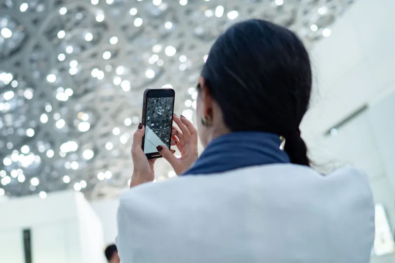
Museum photography can feel like a test you didn’t revise for. The object is behind glass, the room is darker than it looks, a spotlight is bouncing off the case, and a small sign politely reminds you that flash is banned. You take the shot anyway. Later, on the train home, you find a photo of your own coat reflected over a Roman coin.
This is a practical routine for getting better phone photos of exhibits in UK museums and galleries — the kind of images you can use for a blog post, a school project, a local history feature or a client mood board. No flash, no fakery, no over-edited texture that turns a carved stone into a smear.
First, work out what the light is doing
Gallery lighting is rarely simple. You might have cool daylight from a high window, warm spotlights aimed at the object, and a greenish glow from an emergency exit sign nearby. Your phone’s auto white balance will try to make sense of all that and often pick the wrong answer.
Before you shoot, look for the brightest and darkest parts of the case. If the object is lit by a warm spot but the surrounding room is cool, don’t expect one tap to fix everything. Get the exposure right first, then decide how much colour correction the photo actually needs.
A useful trick in UK museums is to photograph the information label as well as the object. The label gives you a neutral white or cream reference, and it keeps the caption accurate when you edit later. It also stops you from “correcting” a deliberately warm bronze into a cold grey lump.
Phone settings for low gallery light
Start by turning flash off. This is not just a rule-following exercise: flash on glass is a disaster. It creates a hard white hotspot and can bounce straight back into the lens.
Use these settings as a baseline:
- Turn off auto flash and leave it off.
- Enable grid lines so you can keep the object level and leave a little breathing room around the case edges.
- Tap to focus on the object, not the glass. If your phone lets you, drag the exposure slider down slightly. Gallery spotlights blow out highlights quickly.
- Lock focus and exposure if your phone supports it. On many phones, a long press on the subject does this. It stops the camera from hunting every time someone walks past.
- Use the volume button or a timer to take the shot. Prodding the screen can introduce shake in low light.
- Try night mode selectively. It can help with a static object, but it may also brighten reflections and soften fine detail. Take one with it and one without.
If you have a phone with a pro or manual mode, keep ISO as low as you can while still getting a sharp shot. A little noise is more honest than aggressive noise reduction that turns engraving into mush.
Beat the glass without editing miracles
The reflection is usually the real enemy. Move slowly around the case and watch how the bright rectangles of windows and ceiling lights slide across the glass. There is often a small angle — maybe only a few degrees left or right — where the worst reflection falls away from the object.
Hold the phone close to the glass if the case allows it, but angle it slightly rather than pressing flat. A phone held square-on to glass can reflect your own face and shirt. Cupping a hand around the lens helps, and a dark jacket or scarf used as a shield can work wonders. Don’t tap the case, lean on it or use a tripod where it isn’t allowed; ask staff if you’re unsure.
For camera users, a circular polarising filter can reduce some reflections, but it won’t remove every spotlight. It also costs you light, which matters in a dim gallery. On a phone, a clip-on polariser is fiddly and can vignette; use it only if you already own one and can test it quickly.
Sort out mixed gallery colour
Auto white balance is a guess. In a room with mixed lighting, it often guesses wrong. If your phone has a white-balance lock, point it at the label or a plain white card under the same light as the object, lock it, then reframe. If not, leave auto white balance on and fix the colour later — but do it gently.
In editing, resist the urge to make everything neutral. A bronze should still look bronze. A stained-glass panel can be warm. What you want is a believable starting point, not a sterile catalogue image. Use the label as your anchor: if the label looks white in real life and yellow in the photo, warm light is the likely culprit. If the label looks green, the room may have a fluorescent or LED mix that needs a small tint adjustment.
The honest edit: labels readable, texture intact
A good museum edit is mostly restraint. Open the photo and do these checks in order:
- Exposure: bring down highlights first. Spotlit edges and glass hotspots recover badly, so don’t push shadows too far up.
- White balance: nudge temperature and tint until the label and the object’s midtones look plausible. Stop before the object looks like a different material.
- Contrast: keep it modest. Heavy contrast makes reflections more obvious and crushes detail in dark cases.
- Texture and clarity: use sparingly. A little can help a faded inscription; too much makes stone look sandy and fabric look hairy.
- Noise reduction: zoom in on a detailed area, such as an engraving or woven textile. If the detail starts to look painted, back off.
- Local adjustments: if your editor supports masks, darken a distracting reflection rather than cloning it out. For editorial or reference use, that’s more honest and much quicker.
Finally, check the label crop. If the text is readable, keep it. If it’s blurry beyond rescue, don’t sharpen it into a mess — crop it out or use the museum’s own object number in your notes. A clear photo with an honest caption beats a fake-sharp close-up every time.
Museum glass will never be your friend, but it doesn’t have to ruin the shot. Move around the case, lock the exposure, keep the flash off and edit like you’re trying to preserve what’s there — not improve on it.